About This Project
Patrapath Prakashani — When Book Covers Need to Sell Stories Before the First Page
The Client
Patrapath Prakashani is a Bengali publishing house based in Kolkata, operating in a market that most people outside Bengal don't fully appreciate. Bengali readers are serious about their books. College Street is still one of the largest book markets in the world. Boi Mela (Kolkata Book Fair) draws millions every January. And Bengali publishers compete not just on content but on how a book looks and feels in your hand.
Patrapath publishes across genres — detective fiction, thriller, supernatural horror, adventure, literary fiction — and sells through both physical bookstores and their own online shop at patrapath.com. They needed book covers that could work in both worlds: eye-catching enough to stop someone flipping through a stack at a College Street stall, and sharp enough to hold up as a thumbnail on a phone screen.
The Challenge
Bengali publishing has a specific design problem. Walk through any bookshop in Kolkata and you'll see two extremes: covers that are beautifully illustrated but feel old-fashioned, and covers that try to look modern but end up looking generic — stock photos with Bengali text slapped on top.
Patrapath wanted something in between. Covers that felt cinematic and contemporary, but were rooted in the Bengali visual tradition. Specific challenges:
Genre variety. The batch included detective fiction, military thriller, supernatural horror, adventure, and literary fiction. Each genre has its own visual language and reader expectations. A detective cover that looks like a horror novel confuses the buyer.
Bengali typography as a design element. Bengali script is gorgeous but tricky in cover design. It doesn't have the same spacing conventions as English, and most designers treat it as an afterthought — pick a font, type the title, call it done. Patrapath wanted typography that was part of the illustration, not layered on top of it.
Online and offline. A cover needs to work at full size on a shelf and as a tiny rectangle on someone's Instagram feed or an e-commerce listing. That means bold composition, readable title at small sizes, and colours that pop on screens.
Series consistency. Some titles were part of a series (Bikramadabr Goyendagiri had two volumes). These needed visual continuity while each still standing on its own.
Our Approach
We treated each cover like a film poster. Not in a gimmicky way — in the sense that a cover, like a poster, has about two seconds to communicate genre, mood, and quality before someone decides to pick it up or scroll past.
Illustration-First Design
Every cover in this batch is hand-illustrated. No stock photos, no AI generation, no template layouts. The illustration drives the composition, and everything else — typography, colour, publisher branding — is designed around it.
This was a deliberate choice. In the Bengali publishing market, illustrated covers carry a different weight than photo-based ones. They signal that the publisher invested in the book. They feel crafted. And for genre fiction especially — detective, thriller, supernatural — illustration gives you the freedom to create imagery that photography can't easily deliver.
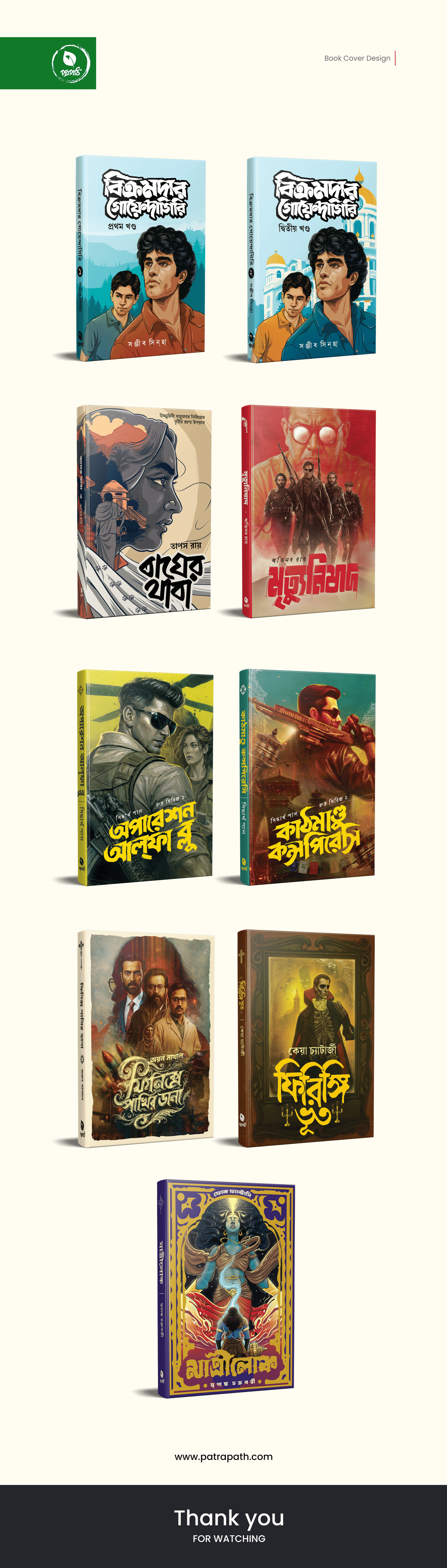
The Covers
বিক্রমাদব্র গোয়েন্দাগিরি (Bikramadabr Goyendagiri) — Volumes 1 & 2
Author: Sanjib Singha
A detective series. We designed both volumes as a pair — same character portrait style, same warm beige-and-brown palette, same composition logic — so they'd look like they belong together on a shelf. The protagonist is illustrated in a youthful, confident style with an adventure-tinged background. Volume 1 and Volume 2 are distinguished by subtle background shifts while keeping the character and typography treatment consistent. Bengali title in bold red-brown handlettered style.
বাঘের থাবা (Bagher Thaba)
Dark, moody, cinematic. The cover splits the composition diagonally — a woman's face in cool grey tones against architectural elements. The Bengali title বাঘের থাবা is set in a chunky, stencil-inspired typeface that feels dangerous. The overall mood is noir thriller — you know exactly what genre you're picking up.
মৃত্যুনিপাত (Mrityunipat)
Military thriller. The cover shows a group of armed figures silhouetted against a red-washed building — the kind of image that says "action" and "stakes" immediately. The Bengali title মৃত্যুনিপাত is set in a bold, angular typeface with red accents. The colour palette is red, black, and gold — aggressive and high-energy. This is a cover that works from across a bookstore.
অপারেশন আলফা ব্লু (Operation Alpha Blue)
Espionage and action. The illustration leans into the cinematic — a protagonist in tactical gear against a war-torn, smoke-filled environment. Green and brown military tones dominate, with the Bengali title handlettered in a style that echoes military stencil fonts adapted for Bengali script. The 3D mockup shows how the cover wraps around the spine and back — something we designed for physical retail presence.
কাশ্মীরে কন্সপিরেস (Kashmire Conspiracy)
Geopolitical thriller. The cover features a protagonist against an explosive, chaotic background with warm orange-and-brown tones. Military figures in the background suggest conflict and conspiracy. The Bengali typography is bold and condensed, fitting the genre's aggressive visual language. The composition is deliberately crowded — it mirrors the chaos of the story.
ফিরিঙ্গি শাহিব ভজনা (Firingi Shahib Bhajna)
Author: presumably a historical fiction
This cover takes a different approach — warm, period-specific, with a sepia-toned composition featuring suited figures in a colonial-era setting. The Bengali title uses a more classical, ornate typography style that signals "historical" rather than "action." The palette is muted browns and golds, suggesting heritage and intrigue.
ফিরিঙ্গি ভূত (Firingi Bhoot)
Author: Dekha Chatarthi
Supernatural fiction. The cover leans hard into horror — a ghostly figure framed in a golden ornate border, glowing eyes, eerie lighting. The Bengali title ফিরিঙ্গি ভূত uses a stylised, hand-drawn typeface in gold against the dark background. The ornate frame motif is a smart choice — it references old Bengali book illustration traditions while the lighting and colour grading feel thoroughly modern.
মাখীলোক (Makhilok)
The standout of the batch visually. A purple-and-gold palette with a mystical, otherworldly figure at the centre — hands emanating energy, ethereal elements floating around. The ornate gold border frames the composition, and the Bengali title sits in a traditional calligraphic style at the bottom. This cover bridges literary fiction and speculative fiction — it's beautiful enough to work as art, commercial enough to sell on a shelf.
Typography System
Across all nine covers, Bengali typography wasn't treated as an overlay — it was designed as part of each illustration's composition. Each genre got its own typographic treatment:
Detective fiction: Warm, handlettered, slightly retro
Military/espionage thriller: Angular, stencil-inspired, aggressive
Supernatural/horror: Ornate, stylised, gold accents
Literary/speculative: Classical calligraphic, elegant
This approach means every cover communicates its genre through typography alone, before you even register the illustration.
3D Mockups for Presentation
Every cover was rendered as a realistic 3D book mockup — showing the front cover, spine, and perspective angle. This is important for two reasons: it gives the publisher marketing-ready images for social media and online listings, and it lets the author and editorial team see how the cover will actually look as a physical book, not just a flat JPEG.
The Results
9 fully illustrated book covers delivered — each with custom illustration, genre-specific Bengali typography, and publisher branding.
Consistent publisher identity — the Patrapath logo (a stylised bird mark) appears on every cover, building visual recognition across titles.
3D mockups for all titles, ready for use on patrapath.com product listings, social media, and Book Fair promotional materials.
Genre differentiation — readers can identify the genre from the cover's visual language alone, which directly improves discoverability in bookstores and online.
Boi Mela ready — covers designed to compete at the Kolkata International Book Fair, where thousands of titles sit side by side and shelf presence is everything.
What We Delivered
DeliverableDetailsBook Covers9 titles across 5+ genresIllustration StyleHand-illustrated, cinematic compositionTypographyCustom Bengali typography per genreSeries DesignBikramadabr Goyendagiri Vols. 1 & 2 matched pair3D MockupsRealistic book renders for every titlePrint-Ready FilesCMYK, bleed, spine-calculated for physical printingDigital AssetsRGB versions optimised for web and social media
Tools & Technologies Used
Digital Illustration, Bengali Typography Design, Print Production (CMYK), 3D Mockup Rendering, Book Cover Layout, Genre-Specific Visual Design